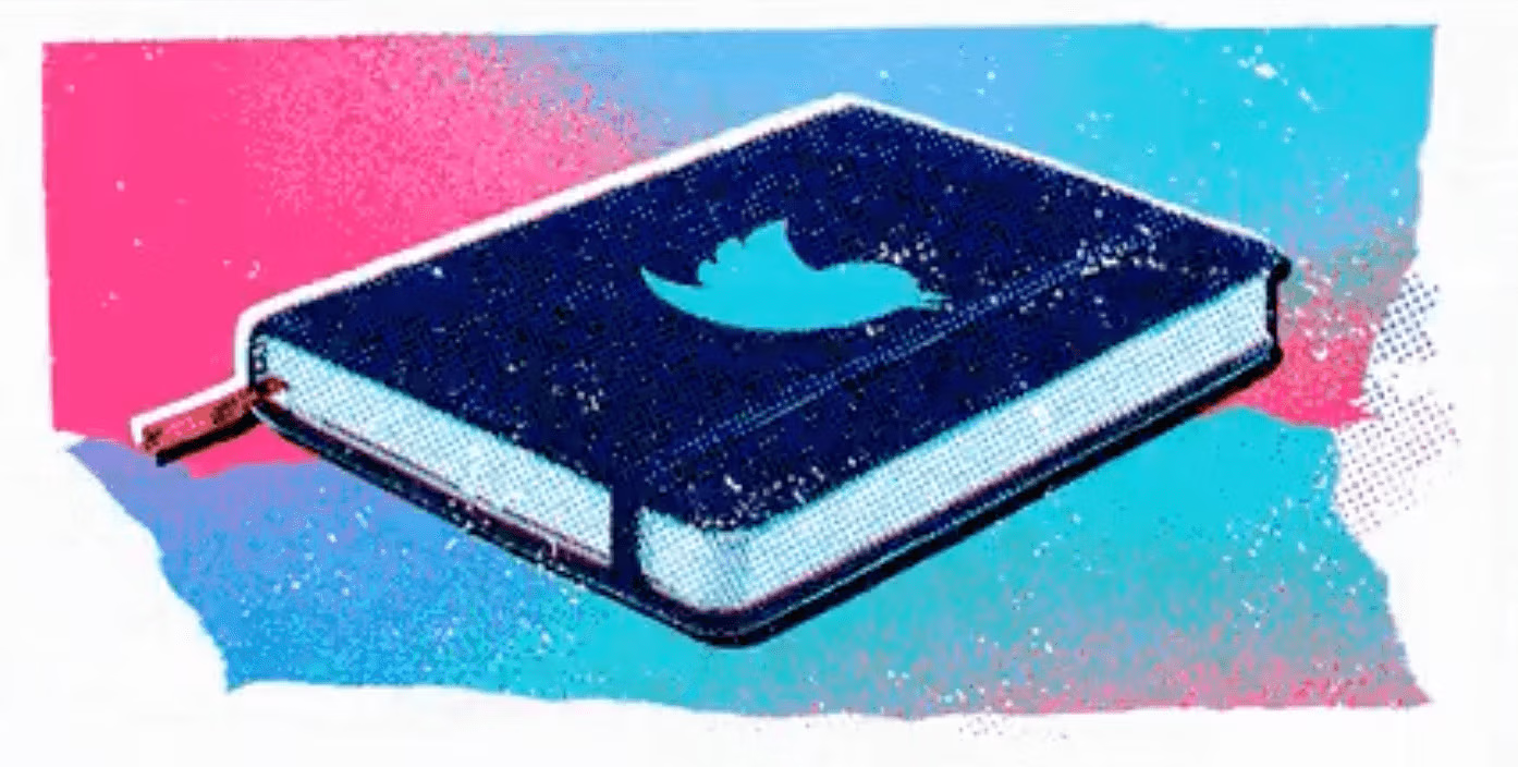
Twitter Notes vs Medium

With Notes, you can waffle to your heart’s content without the usual 280-character limit. As for the likes of Medium and SubStack, it’s probably feeling a little toasty around their derrières. 🔥

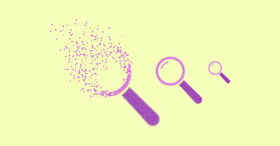
The ‘Search-Bait’ Design Pattern →
Despite the similarities between Twitter and Medium, one glaring difference is the search and discovery experience. Social media apps these days adopt a pattern that merges the search bar into an ‘explore’ page. It can leave you feeling like you went to the supermarket for milk and came out with a Christmas candle, multipack of M&Ms, and a novelty pair of slippers — all very nice, but not what you went there for in the first place. Instagram is definitely the worst offender.

Instagram’s Immersive Feed is a Pig Trough →
Speaking of Instagram, just as I was getting the hang of Sunday selfies and algorithms, Instagram pulled the ol’ switcheroo on us, and now my feed looks more like a cross between TikTok and the QVC network. Rob Diaz sums up what’s going on with their new ‘Immersive Feed’ — it doesn’t look quite as healthy as the rebrand did.


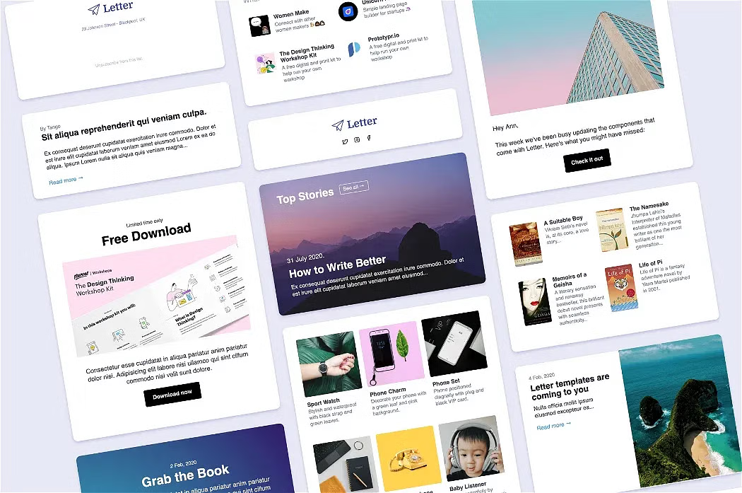
Letter
Here’s one you might have missed:
All those Instagram pigs might have you hungry for…a hamburger footer!
Hamburger Footer: Reaching the Bottom of Infinite Scroll: If like me, you feel regular frustration (and potential onset repetitive strain injury) from having to scroll aaall the way to the bottom of a webpage to get to the footer navigation, Graeme has some solutions for you. Take inspo from Dribbble’s ‘Load More’ button, Airbnb’s ‘Sticky Footer’, or Etsy’s old-school pagination.
My lizard brain is no match for infinite scroll. Alex Ellis

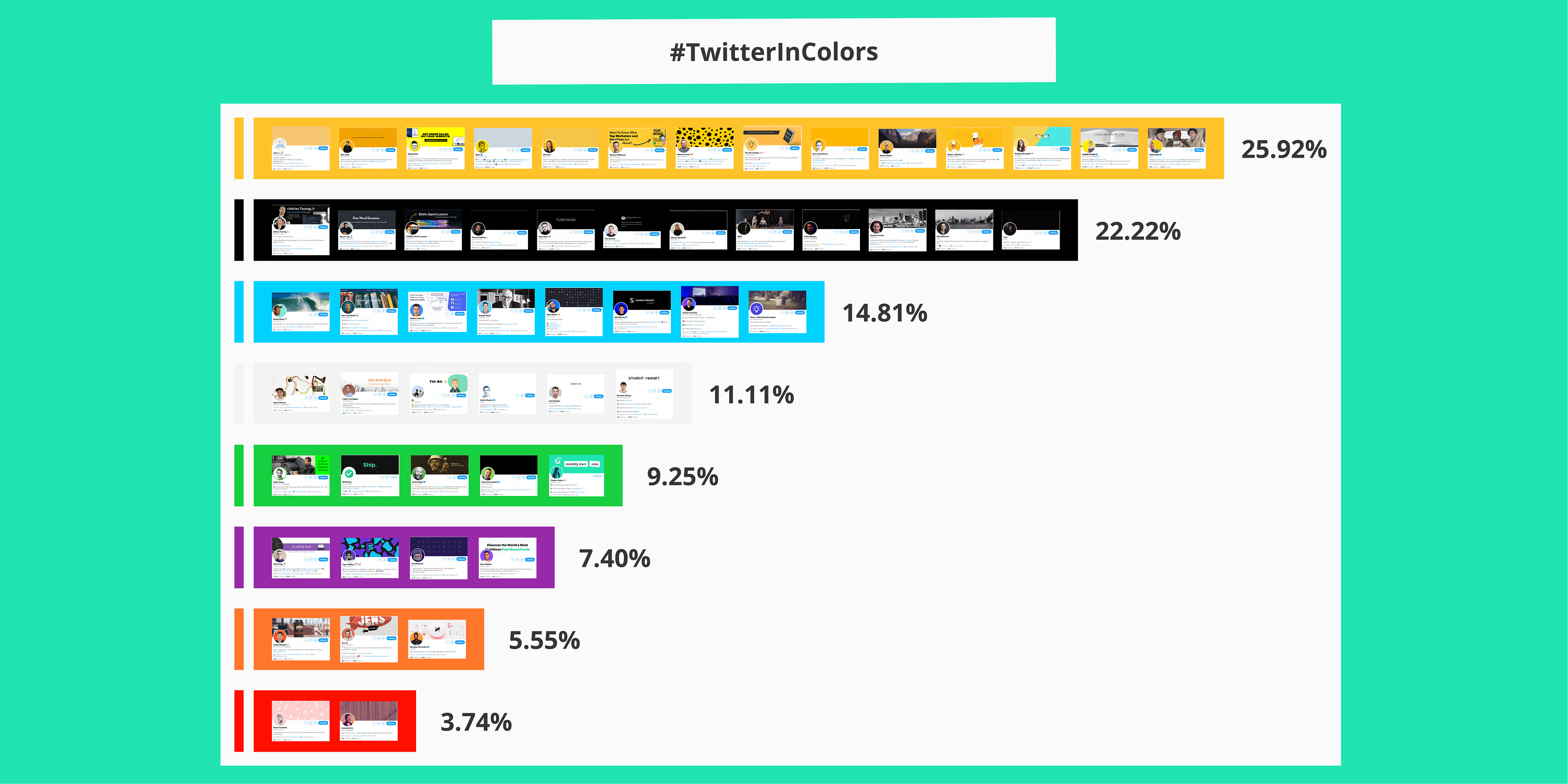
Tweet All About It 🐦
A curation of some of the latest products and designers featured over on our Twitter.
Make Way Grid Effect: A neat little grid interaction from Manoela Ilic where adjoining items make way to a selected one that expands.
How to make absolutely any app look like a macOS app 🤓: Creating a more “seamless” experience for our users by employing similar design conventions.
Product research made easy with Ballpark: A brand new product from the Marvel App team - super fast async product research for Marvel and Figma prototypes, designs and copy.
More than ticking boxes - accessibility in design: Building accessible digital products way beyond a ‘compliance checklist’ to ensure max impact, by Cat Noone.

Want to see more? Head over to Twitter.com/Prototypr.
The new Prototypr platform is Web Monetized — check it out!
✍️ We're accepting new contributors. Apply here.
 Buy me a coffee